martes, 14 de julio de 2015

Last post

This blog was created just to show the own understanding in the course "Interaction Design" of the European Master in Software Engineering. Previously I had some experience in this field, since I worked on the Computer Science and Engineering School (ETSIINF) official app of the Universidad Politécnica de Madrid (UPM) for my Bachelor's final project. 


In the case of the Bachelor's project, I started from a software prototype, as i said in another post these protos are not throw-away, so I did not throw it into the trash, hehe. This proto with few functionalities had to be reviewed, refined and finally extended with new functionalities to get the first release of the app.


However, in the case of the Master's project, I started from scratch, from a hypothesis, that we had to confirm through a qualitative study in order to understand the context of use. Once known users + tasks + environment, we started developing, first a paper prototype, and continue redefining and supplementing it with a mock-up (high-fidelity prototype). Due to the time constraint of the course, the idea was finished here :( ...maybe someday I return


--------------------------------------------------------


AND THAT'S ALL FOLKS! …until here… the course is over…

miércoles, 17 de junio de 2015

Integration of usability practices into the software development process


Do you want to support a User Centered Design?

If that's the case, let's see in this post how the tool Usability Planner can help you plan which usability methods to apply in your user-centered approach.

First we are going to start with an introduction to this challenge, integrate usability practices into the development process of an organization is difficult, the software engineering is prevalent in many organizations even knowing that usability is a critical software attribute. 
Since the late 90s in the HCI community there has been a "war" between the relationship of the disciplines of software engineering and HCI, and how to integrate the two. Each discipline has different approaches and success criteria, on the one hand, software engineering is systematic, disciplined... with a target focused in the process (following a plan) and with the success criteria of finishing the product on time and on budget, on the other hand, HCI is more ready to change, less controlled... with a target focused in usability and with the success criteria of meeting the user needs with the product. 
After reading a paper [1], I want to add the figure below in which we can see a summary of the activities of both.


In 2001 the Manifesto for Agile Software Development appears and the practice of UCD changed in the sense that the iterative usability evaluations within an agile context should be rapid and efficient. Software engineers rapidly adopted the agile approach, and embedding usability evaluations in an agile software development process provides timely feedback from users and results in intensive collaboration between usability experts and software developers.
The HCI and software engineering processes closely cooperate during the design and implementation of interactive systems and products.

Interactions and information exchanges between the processes
In an interesting study about a health-management system conducted in three stages to understand the role of iterative usability evaluation during agile development [2], they got the following diagram in where we can see that the usability experts play a significant role in the software development process. This role is to be the communication bridge among developers and users throughout the three iterations of this process.
the usability experts played significant roles
To better understand the role of iterative usability evaluation during agile development, we recently conducted a study - See more at: http://www.uxmatters.com/mt/archives/2014/08/the-role-of-iterative-usability-evaluation-in-agile-development-a-case-study.php#sthash.uz2joL1V.dpuf


iterative usability evaluations within an agile context should be rapid and efficient - See more at: http://www.uxmatters.com/mt/archives/2014/08/the-role-of-iterative-usability-evaluation-in-agile-development-a-case-study.php#sthash.uhnQiE9z.dpuf

Having seen the origin of this challenge, let's talk about the Usability Planner tool. The purpose of the tool is, once identified the necessary UCD activities in the phase (Analysis, Design or Evaluation, usual stages of a software project) where the user wants , then select the most appropriate methods based on the design and organizational context (constraints related to the software engineering approach affecting its final objective[time, budget]) and finally, you get the plan with the suggested methods, classified within a range, which can be personalized by yourself.
This tool is based on success factors for selecting the methods, instead of looking at the strengths and weaknesses of each method along with its cost.
1)
Select the phase and related activities
2)
Select the constraints
3)
Method range

--------------------------------------------------------

I think the tool works really well for what it was created. And as it is said feedback is welcome, I wanted to point:

Navigation: Only when you have started the tool, you can go to the other screens(Home, About, Feedback), but if you are in About or Feedback screen it is not possible to go to Home screen

Tool has started

About screen


Consistency: Another thing also is that in the home screen appears the names of the three creators of the tool, but in About and Feedback screen only two of them.


Home screen
About screen


These are not important points, just little things to change :)


[1] Buie, E., A., & Vallone, A. (1997). Integrating HCI engineering with software engineering: A call to a larger vision
[2] Yanfei Ma, Yunhui Lu, and Dinara Saparova, The Role of Iterative Usability Evaluation in Agile Development: A Case Study.

miércoles, 10 de junio de 2015

Usability evaluation


¿? Why, what, where and when to evaluate ¿?

This is a brief post about usability evaluation, task that we did this semester to evaluate our high-fidelity protoype.

WHY
Because we wanted to find the usability problems of our design we carried out a usability test in order that users can use the software and like it (in short "check users' requirements").

WHAT
In our case, an early prototype of the new system. Actually, the proto is not so early, since we did one previous paper prototype to this mock-up.

WHERE
In natural place, for us were the technical schools, ours and the participants. 

WHEN 
Throughout design of the software product.

All these questions due to the iterative design is a continuous process. From the beginning to the final product and beyond as finished products can be evaluated to gather useful information on upcoming new products.

Within the usability evaluation techniques, they can be classified into:
  • Analytical evaluation: Is a sability evaluation without users.
  • Usability testing: Is a evaluation with representative users.
    • Performance measurement
    • Thinking aloud protocol
    • Laboratory testing
    • Field testing
    • Wizard of Oz
    • Pluralistic walkthrough
    • Controlled experiments
We used the thinking aloud technique and we had the chance to find out first hand how our users(Chinese students) use the software product :)  as a result we got a  list of usability problems; quantitative data on time, eror and other performance measures; our recorded/written remarks; and participants' remarks gathered from questionnaires.
  • Follow-up studies of installed systems: It requires a system already working.
    • Focus groups
    • Automatic loggin
    • Surveys and interviews
Next post about integration of usability practices in software development ...

lunes, 8 de junio de 2015

Internationalization


In this post I am going to talk of addressing a global audience with your software developed. Following the guidelines for international design seen in class:
  • Be careful about using images that depict hand gestures or people.
  • Use generic icons. 
  • Choose colours that are not associated with national flags or political movements.
  • Ensure that the product supports different calendars, date formats, and time formats.
  • Ensure that the product supports different number formats, currencies, weights and measurement systems.
  • Ensure that the product supports international paper sizes, envelope sizes, and address formats.
  • Avoid integrating text in graphics as they cannot be translated easily.
  • Allow for text expansion when translated from English.
If you want to have a greater user diversity, you have to analyze some cultural aspects of your possible users, for example, the language. To research in the field of culture, it is advisable "the six dimensions of national culture" - Geert Hofstede research.
Develop a software application in a single language, Spanish for instance, may cause the loss of many potential non-Spanish speaking users. It is common that when looking for an application, the user makes the decision to acquire/purchase an application or another depending on whether it is compatible with his/her native language.

The process to make an international version of a software application, as far as language is concerned, is usually divided into the following two steps:
  • Internationalization: The process of introduce externally editable strings in the source code. In turn also it involves the use of certain format methods for dates, numbers, etc. This work is done by the developer himself.
  • Location: The process of editing these externalized strings for a given language. This work is usually done by a professional translator.
-------------------

And to finish this post, I want to show a sample of cultural differences regarding reading direction in the languages.


left_to_right
right_to_left

top_to_bottom


In the case top_to_bottom it can be written horizontally or vertically, so the example of the elements in the settings screen would be the same as in the case left_to_right. To be able to see a sample of the difference in the reading direction we have to see it in a text editor app.


jueves, 14 de mayo de 2015

Usability guidelines & heuristics

Design guidelines are specific principles helpful for taking design decisions. There are guidelines for particular products (sure for all of the market), but general guidelines "rules of thumb" for interaction design when used for evaluation purposes are called "heuristics". The most famous and influential heuristics are the Nielsen's heuristics. In 1990 Jakob Nielsen and Rolf Molich developed these heuristics written in the paper "Heuristic Evaluation of User Interfaces", afterwards the revised final version of Nielsen was released in 1994. 

A heuristic evaluation (analytic technique) is a process where an expert (someone trained in usability or Human Computer Interaction) reviews a software application and compares it against a set of principles (heuristics) in order to make more usable applications. The expert supplements the evaluation with real users, but does not replace it. Because different people find different problems, it is advisable to have multiple evaluators, not just one, to find many problems as possible.

Let's see the Nielsen's 10 usability heuristics with examples of each one...

1) Visibility of system status

Gmail - Attaching a file
Facebook - Login


Both systems are giving feedback to the user about what is going on, in the Gmail case when a user wants to attach a file to the message a progress bar appears, suppose that you want to attach a heavy file and the user is waiting, waiting,... and finally gets desperate if he doesn't see how it will progress. The Facebook case is similar to the last one, to know that the login is in process it shows an iOS Activity Indicator (loading spinner).

2) Match between system and the real world

iTunes - Library navigation
Maps - Location and itinerary


iTunes uses the Library as a methaphor. The system speaks the user's language to differentiate and organize the elements the library contains concepts familiar to the user, including Music, Movies, TV Shows, etc. In the other case, the Google Maps application shows where you are with a pointer, the name of your location at the bottom and, if you want to find an itinerary, at the top it shows "FROM: x TO: y" the info appears in a natural and logical order following the real-world conventions .

3) User control and freedom

Excel - Entering equation
Facebook - Timeline


Since users don't like to feel trapped by the computer, as I said they only want to get on with his work, imagine that you are working with Excel, introducing an equation, and suddenly you noticed that you made a mistake...don't worry, you can return to previous state. Also Facebook is able to go back screens after going to someone else’s timeline or another post. Further it gives options to hide, delete or edit a post that you wrote on your timeline .

4) Consistency and standards

Gmail
Office


Users don't have to wonder whether different words, situations, or actions mean the same thing, for that reason Gmail used the same words/concepts that every user of a traditional mail application knew (Inbox, Drafts,...). Office suite is composed of applications that follow a series of platform conventions to give it consistency.

5) Error prevention

Introducing username
LinkedIn - New session


Careful design avoids many problems, it is better to prevent a failed user input than to send error messages after. For instance at the time of introducing username in an application to create a new account will be better a pattern in the textbox which guides the user instead of a message. As LinkedIn does, preventing the logon until the user and password are introduced, by disabling the button.

6) Recognition rather than recall

Browser - Looking for something
KeyNote - Font options


Computers are better in memory than us, in order not to remember information if you are looking for information in the browser, with the first characters introduced the immediate action is the emergence of previously visited URLs or searches, just in case you want to visit then again. Another example in KeyNote, instead just font names when you are selecting fonts it shows the preview of the font.

7) Flexibility and efficiency of use

Twitter - shortcuts
Matlab - Command completion


Through some strategies can be made advanced users more efficient. One strategy is the keyboards accelerators such as the Twitter keyboard shortcuts or the command completion that MatLab has or integrated development environments. The goal of all these strategies is to speed up the user interaction.

8) Aesthetic and minimalist design


Google account
Chrome - Browser


Google is a good example of minimalist design, the previous browsers were a mess with all mixed, they should not contain info which is irrelevant in a search. Every extra unit of information, in a browser in this case, diminishes the relative visibility, that not happen in Chrome. In the Google page for login in your account there is exactly what is necesary with no distractions. It maximizes its use making things simpler, whitin a few time you have registered.

9) Help users recognize, diagnose, and recover from errors


Starting a new account
OS - Adding new hardware


Error messages should be expressed in understandable language, an error message like "ErrorCode 0xa056e12d", as we often see while debugging a program, says nothing to a normal user (only at developer level). It is better the way OS explains in clear terms how to solve a hardware problem. or when creating a new account, highlight the specific fields that the user forgot to fill out indicating specific instructions.

10) Help and documentation

Justinmind - Video tutorials
Help button


This heuristic perhaps looks least important in comparison with the others which focused in ease to use a system, anyway he have to provide documentation on how to use the system or help on how to solve a possible problem. Embeded videos, as kind of documentation, can be used to showcase features as well as get people started using a product, as the ones you can find with the tool Justinmind. In every app should be easy to search info as through a help button.
--------------------------------------------------------

Actually there are more guidelines & heuristics than the popular Nielsen's. Susan Weinschenk and Dean Barker researched usability guidelines and heuristics from many sources and created a categorization into 20 in their book.

lunes, 11 de mayo de 2015

Prototyping

A prototype is NOT a demo!

A prototype is a representation of all or part of a system that, although constrained in some way such as user confusion between the prototype and the final system, can be used for evaluation in the iterative development which is largely based on this tool.
Let's remember the step where we are [Evaluate the designs] within the iterative process watching the graph below:


Prototypes can help designers refine their ideas (implementation, "look and feel" and so on) and discover previously unknown issues. Also they can build empathy for users and they communicate to clients, users and designers.
This tool is really good in the process for design human-computer interfaces serving user needs. "One of the most productive uses of rapid prototyping to date has been as a tool for iterative user requirements engineering and human-computer interface design." [1]
We can distinguish between two types of prototypes:
  • Low fidelity prototypes, how can it be the Paper prototypes. These kind of prototypes are very cheap, easy and quick to make; and comply perfectly with the objectives of the task to be tested with the user. 
 
The one we did during the course

To simulate the interaction can be used what is known as chauffeured prototype, that implies to use a paper prototype in a given scenario and the designer manually demonstrates how the interface would respond to user actions.

  • High fidelity prototypes, how can it be Mock-ups (throw-away) and Software prototypes (not throw-away). There are different mock-ups tools availables depending on your target: Mobile [Justinmind, FLuidUI]; Web [Dreamweaver, Photoshop]; Multiplatform [Balsamiq]; Multipurpose [Powerpoint, Visio].
  • As our project is a mobile application, it is used Justinmind. It is a nice and easy to use tool (drag&drop tool) which allows to display a running prototype in a simulator or on the device itself.

Getting started with the tool :)


On the other hand, Software prototypes are not thrown away, they serve as a base container that gets extended with real content. They are done in an IDE such as Eclipse, Xcode, Visual Studio... 


[1] S. P. Overmyer: Revolutionary vs. Evolutionary Rapid Prototyping: Balancing Software Productivity and HCI Design Concerns. Center of Excellence in Command, Control, Communications and Intelligence (C3I), George Mason University, 4400 University Drive, Fairfax, Virginia.

jueves, 30 de abril de 2015

Visual Design

We communicate using verbal communication (that can be read or heard) as well as non-verbal (that can be seen). In our world the second one could be called visual communication, a good visual design makes a difference, this mean create a good "visual" communication with the viewer.
For example if you want to buy a magazine, when you come in the newsstand, would you rather buy a magazine that looks nice with an organized content cover, layout colors, etc or would you buy the one that has a simple white cover with an impossible to read typography?
The answer to this question is easy,  the human eye is all around the visual appeal that leaves the audience an impact in their mind, so the one which looks nice. 


'Visual design focuses on the aesthetics of a site and its related materials by strategically implementing images, colors, fonts, and other elements.  A successful visual design does not take away from the content on the page or function.  Instead, it enhances it by engaging users and helping to build trust and interest in the brand' [1].

After reading the above definition from Visual Design Basics (usability.gov), I can say visual design offers a way to utilize every possible visual means to communicate effectively with the intended audience. It relies on the aesthetic values to pass a clear message to the viewer.

As any designer should know, the design doesn't have rules or recipes, you have to think about it a lot depending on each system. Each case require the use of creative thinking to solve visual communication problems, potential points to take into account are: Simplicity, visual consistency, visual metaphors, organization, colour and typography.

SIMPLICITY
"Everything should be as simple as it is, but not simpler." - Albert Einstein

There’s something inherent in human beings that prefers the simple to the complex, something free from complexity or division into parts, subtracting the obvious and adding the meaningful. This point of view is about making something easier to understand.
There is a book which uses a remote control to illustrate four strategies to simplify a product [2].


Remove: Get rid of anything that isn’t essential to the remote.
Organize: Arrange the elements of the remote so that they fit into logical parts based on the person’s mental model.
Hide: Place the most important elements within reach, and hide the others, making them accessible through a cover.
Displace: Pushing some of the functionality to another device, so that the remote isn’t responsible for displaying every possibility.
Also you can see John Maeda's ten laws to test and create an idea of simplicity.

VISUAL CONSISTENCY
From a broader perspective of the visual design of something it is important to maintain consistency and common style among all pages. To ensure that this consistency is met, it is useful to develop a style guide book or to serve as a reference document for the entire development team.

VISUAL METAPHORS
A visual metaphor is the representation of something by way of a visual image that suggests a particular association for a human beign. Humans understand metaphors by intuition, for instance... 

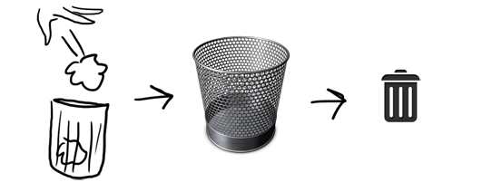
the action of throwing something to the trash is associated by this icon suggesting the trash itself and the action of remove an item from your hard drive.


There is a very widespread questioned issue related with this concept. This issue is the difference between skeuomorph and visual metaphor, What does this strange word means? definition  A classical example of skeuomorphism: Apple’s iCal mimicks texture and layout of a paper calendar, including torn edges, which do not have any function or interactivity. [3] check it in the image below:

Skeuomorphism means an aesthetic overload becoming cheesy and non-functional, that is exactly the opposite of visual metaphors which are useful regarding the mental model of the user.

The skeuomorph paradigm started by Apple has already been abandoned by the major companies over the years.


ORGANIZATION
In order to avoid information overload, the design of each interface should consider user behavior in the visual sweep of the page, distributing information and navigation elements according to their importance in areas of varying visual hierarchy - for example, the upper regions of an interface have more visual hierarchy than the lower ones.

COLOUR / TYPOGRAPHY
Besides the position of each element in the interface, there are other techniques to prioritize information such as: use of size and space occupied by each element to give importance to the visual hierarchy, use of color contrast to discriminate and distribute information, use of typographic effects to emphasize content and use of relief/depth effects to highlight items, etc.

Another important visual aspect of the design is accessibility. In the use of colors, concerning to the last point, must offer sufficient contrast between text and background not difficult to read, and also select color combinations taking into account the visually impaired color perception which might present our users. Another example, by using images in the design for accessibility and comprehensibility, it should take care of their resolution and size in order not to lose context, for instance by minimizing an image excessively.


[1] http://www.usability.gov/what-and-why/visual-design.html
[2] Giles Colborne, Simple and Usable.
[3] Thomas Zhaler, The Truth about Skeuomorphism vs. Flat Design.