We communicate using verbal communication (that can be read or heard) as well as non-verbal (that can be seen). In our world the second one could be called visual communication, a good visual design makes a difference, this mean create a good "visual" communication with the viewer.
For example if you want to buy a magazine, when you come in the newsstand, would you rather buy a magazine that looks nice with an organized content cover, layout colors, etc or would you buy the one that has a simple white cover with an impossible to read typography?
The answer to this question is easy, the human eye is all around the visual appeal that leaves the audience an impact in their mind, so the one which looks nice.
'Visual design focuses on the aesthetics of a site and its related materials by strategically implementing images, colors, fonts, and other elements. A successful visual design does not take away from the content on the page or function. Instead, it enhances it by engaging users and helping to build trust and interest in the brand' [1].
After reading the above definition from Visual Design Basics (usability.gov), I can say visual design offers a way to utilize every possible visual means to communicate effectively with the intended audience. It relies on the aesthetic values to pass a clear message to the viewer.
As any designer should know, the design doesn't have rules or recipes, you have to think about it a lot depending on each system. Each case require the use of creative thinking to solve visual communication problems, potential points to take into account are: Simplicity, visual consistency, visual metaphors, organization, colour and typography.
SIMPLICITY
"Everything should be as simple as it is, but not simpler." - Albert Einstein
"Everything should be as simple as it is, but not simpler." - Albert Einstein
There’s something inherent in human beings that prefers the simple to the complex, something free from complexity or division into parts, subtracting the obvious and adding the meaningful. This point of view is about making something easier to understand.
There is a book which uses a remote control to illustrate four strategies to simplify a product [2].
Remove: Get rid of anything that isn’t essential to the remote.
Organize: Arrange the elements of the remote so that they fit into logical parts based on the person’s mental model.
Hide: Place the most important elements within reach, and hide the others, making them accessible through a cover.
Displace: Pushing some of the functionality to another device, so that the remote isn’t responsible for displaying every possibility.
Also you can see John Maeda's ten laws to test and create an idea of simplicity.
VISUAL CONSISTENCY
From a broader perspective of the visual design of something it is important to maintain consistency and common style among all pages. To ensure that this consistency is met, it is useful to develop a style guide book or to serve as a reference document for the entire development team.
VISUAL METAPHORS
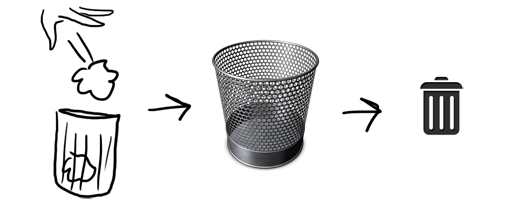
A visual metaphor is the representation of something by way of a visual image that suggests a particular association for a human beign. Humans understand metaphors by intuition, for instance...
the action of throwing something to the trash is associated by this icon suggesting the trash itself and the action of remove an item from your hard drive.
There is a very widespread questioned issue related with this concept. This issue is the difference between skeuomorph and visual metaphor, What does this strange word means? definition
A classical example of skeuomorphism: Apple’s iCal mimicks texture and layout of a paper calendar, including torn edges, which do not have any function or interactivity. [3] check it in the image below:
Skeuomorphism means an aesthetic overload becoming cheesy and non-functional, that is exactly the opposite of visual metaphors which are useful regarding the mental model of the user.
ORGANIZATION
In order to avoid information overload, the design of each interface should consider user behavior in the visual sweep of the page, distributing information and navigation elements according to their importance in areas of varying visual hierarchy - for example, the upper regions of an interface have more visual hierarchy than the lower ones.
COLOUR / TYPOGRAPHY
Besides the position of each element in the interface, there are other techniques to prioritize information such as: use of size and space occupied by each element to give importance to the visual hierarchy, use of color contrast to discriminate and distribute information, use of typographic effects to emphasize content and use of relief/depth effects to highlight items, etc.
Another important visual aspect of the design is accessibility. In the use of colors, concerning to the last point, must offer sufficient contrast between text and background not difficult to read, and also select color combinations taking into account the visually impaired color perception which might present our users. Another example, by using images in the design for accessibility and comprehensibility, it should take care of their resolution and size in order not to lose context, for instance by minimizing an image excessively.


